Walmart: Financial Forecasting Tools at Enterprise Scale
Designing data accessibility and forecasting tools for one of the world's largest internal finance ecosystems — multiple concurrent projects, one coherent system.
Overview
Walmart is the world's largest retailer. Financial forecasting at that scale means analysts navigating massive datasets across thousands of stores, hundreds of product categories, and multiple geographies — using internal tools that had grown faster than their design standards could keep up with.
Inconsistent interaction patterns across interconnected products, no shared language for hierarchy navigation or data visualisation, and workflows that required too much friction between opening the tool and starting actual analysis.
I joined as a Senior Product Designer embedded across multiple projects within the same ecosystem, focused on data accessibility, forecasting accuracy, and design consistency at scale. Specific results are confidential, but the work covered research, interaction design, cross-functional collaboration, and a design operations system I built from scratch.
Selected Work
Started with users before touching any screens.
I ran in-depth interviews with financial forecasters to map actual workflows rather than assumed ones. Three patterns came up consistently: navigating between aggregate and granular data required too much reorientation, metric selection from large unstructured lists was eating time that should have been spent on analysis, and report generation for stakeholders depended on either imprecise screenshots or slow IT requests. That synthesis gave product and engineering a shared picture of where friction actually lived — not where they assumed it did.
Generating image…
Met forecasters inside Excel rather than trying to redesign their behaviour away.
The research made clear that forecasters weren't primarily working in the web application — they were pulling data from it and doing their actual work in Excel, inside models they'd built and refined over years. Rather than designing that behaviour away, the team built a custom Excel add-in that brought the product to where forecasters already worked. The add-in let users browse and pull reports directly into their active spreadsheet, explore and edit data in their own environment, and push updated figures back without leaving Excel. Designing for Office add-in constraints meant rethinking every pattern built for a full viewport: the task panel is narrow, navigation had to be sequential, and the data browsing model needed rebuilding from scratch. The most complex challenge was the write-back workflow — making editable vs read-only fields unambiguous, surfacing clear feedback when a re-upload would overwrite upstream changes, and giving users a review step before committing.
Generating image…
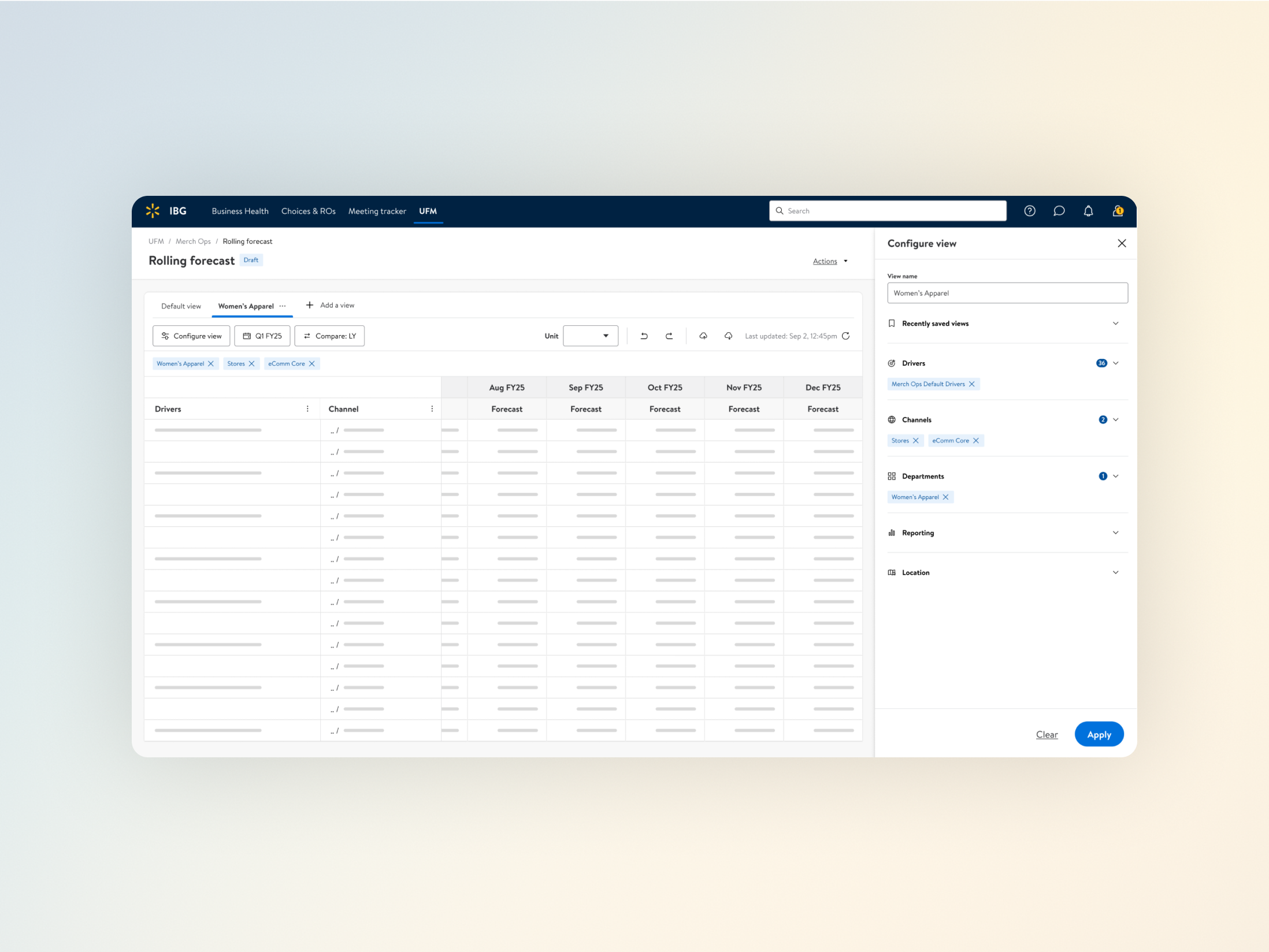
Designed dense table interactions that survive production-scale data.
A significant part of the implementation work used AG-Grid, a high-performance data grid built for large datasets. Making design intent survive in an AG-Grid implementation requires understanding more than how a table looks in Figma: how virtual rendering behaves at tens of thousands of rows, where the grid's grouping model creates constraints, and how edit states should persist or reset under real usage conditions. I worked closely with engineering throughout — writing specs detailed enough to cover edge cases that static mockups miss and running short collaborative sessions to resolve tension between design intent and grid constraints before they became production problems.
Generating image…
Ran usability testing to reduce cognitive load at table and metric level.
I built interactive prototypes for the two highest-friction areas and ran task-based usability studies with actual forecasters. Testing column freezing, expandable row groups, drill-down affordances, and metric search with inline preview against real user tasks surfaced assumptions that didn't survive contact with how forecasters actually think about data hierarchy. Each round of iteration came directly from what the sessions showed, not from designer intuition.
Generating image…
Standardised interaction patterns across a multi-project ecosystem.
Rather than trying to unify visual surfaces across projects with different data structures and engineering constraints, I standardised the interaction patterns that recurred: hierarchy navigation, metric selection, table filtering, and variance presentation. Documenting how each of these should behave gave the ecosystem a consistent backbone without constraining the places where genuine variation was appropriate. Design critiques and cross-team workshops kept alignment active rather than letting it drift.
Generating image…
Built a design operations system that changed how the team worked.
Across concurrent projects, research findings, design decisions, and cross-project dependencies were scattered and effectively invisible to anyone not directly on a given project. I built a custom Airtable-based system to track design progress, centralise research insights, and map dependencies across the whole ecosystem. An automated tagging system meant a designer starting new work on metric selection could surface every relevant prior insight without knowing which project it came from. Decisions became traceable. Work stopped being siloed. The system became standard team infrastructure.
Generating image…
Outcomes
Specific metrics are confidential.
Research-driven redesign reduced navigation steps for core forecasting workflows, measurably shortening time-to-analysis
Shared interaction patterns reduced inconsistency across the ecosystem, improving both design velocity and the experience of users who moved between tools
AG-Grid implementations delivered stable, predictable table behaviour at production data volumes, including under edge conditions that mockup-driven specs routinely miss
The Airtable design operations system became standard team infrastructure, enabling research reuse and making cross-project dependencies visible and plannable
Design critiques and workshops reduced design drift across a multi-project environment with no single shared owner
The Excel add-in drove adoption by meeting forecasters in their existing workflow, with bidirectional data flow enabling edit-and-reupload without leaving the spreadsheet
Process artefacts and interaction patterns available for discussion on request.
Let's Connect
I'm always open to discussing new projects, creative ideas, or opportunities to be part of your vision.